Revamp part D E U X
- June 29th, 2010
- Posted in internet . site . wip
- Write comment

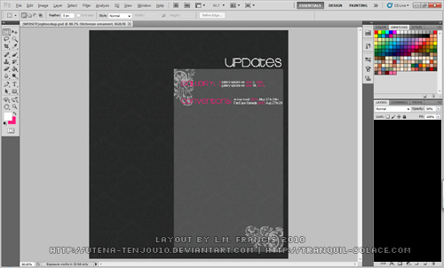
My favourite digital anime artist revamped her website a little under 24 hours ago! The simple layout and colour scheme has me inspired to get cracking on designing a new layout for this site. First I started playing around with patterns in photoshop and I have a think for pinstripes/scanlines…but then that’s been done to death. Going with the damask pattern I’ve been using for other layouts and armed with custom brushes and fonts, I went to town! Last time I designed I layout I used grays/green/orange and blue(so many colours, so little time), this time I think gray/pink and white is enough…keep it as simple as possible! Here’s a larger screenshot for your viewing pleasure.
Also…having 50 billion scroll bars sucks…just sayin’!
No comments yet.