Revamp
- August 24th, 2009
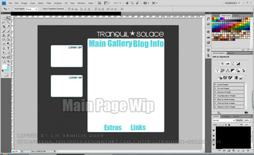
Looking at the site and a few of my favourite art sites gave me the inspiration to tweak Tranquil-Solace’s layout a little bit in photoshop…

I really wanted to have a separate section for my latest gallery additions and works in progress(wip’s).

And this wide layout would be used for all the other pages, excluding the main page.
I’ve even went so far as to doodle out my layout ideas. Hopefully I’ll have this finished, sliced and ready for dreamweaver soon.