Archive for the ‘ site ’ Category

Of boxes and business cards…

So related to my secret project I went and did a little shopping at the dollar store…
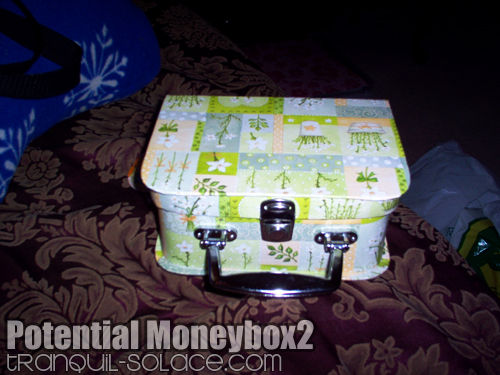
So as part of the project I need a box to hold money in. This one seemed like a good idea but then I realized that I need a box that I can lock. So I’ll have to find another one and come up with another use for this box. And here I thought I’d have a pretty, girly money box!
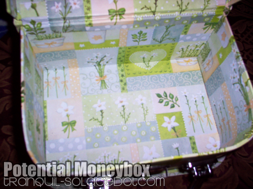
Lots of room to put money and…stuff!
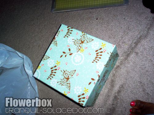
Note to self: Pull feet in when taking photos lol…They really do sell pretty stuff at dollar stores. Now this box is for holding little decorations and decals that I had picked up.
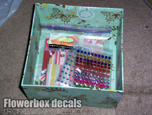
My decals! No wonder scrapbooking is so popular, all the little embellishments for it are so dang cheap!

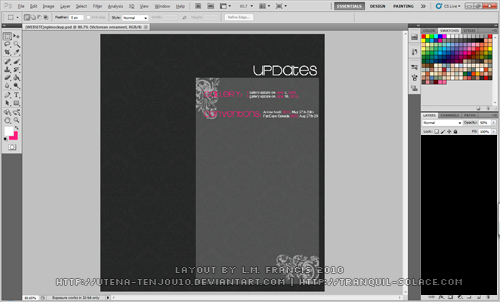
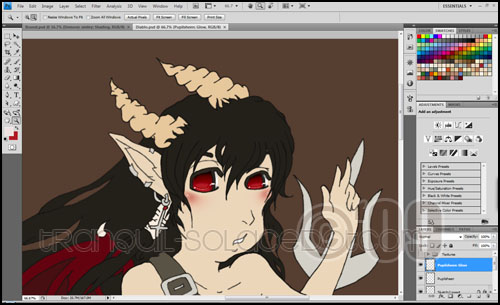
So I took another crack at making business cards and following Finni’s advice, added some artwork to the card design.
[ Read More ➜ ]

To Do List

So with my new found free time might as well organize all the little projects and things that need to be done art wise:

o1. Revamp the layout of the site. Had a couple ideas in mind
o2. Finish the 10 images of my very vague art project. I have 2 of the planned images completed, along with a banner image. Go me!
o3. Complete my business card design. Thanks for the tip Finni!
o4. Just draw MOAR!

So with that list in mind, I’m going to do a little work this afternoon! Starting with this…

[ Read More ➜ ]

Revamp part D E U X

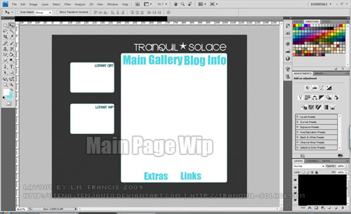
My favourite digital anime artist revamped her website a little under 24 hours ago! The simple layout and colour scheme has me inspired to get cracking on designing a new layout for this site. First I started playing around with patterns in photoshop and I have a think for pinstripes/scanlines…but then that’s been done to death. Going with the damask pattern I’ve been using for other layouts and armed with custom brushes and fonts, I went to town! Last time I designed I layout I used grays/green/orange and blue(so many colours, so little time), this time I think gray/pink and white is enough…keep it as simple as possible! Here’s a larger screenshot for your viewing pleasure.

Also…having 50 billion scroll bars sucks…just sayin’!

Get those creative juices flowing!

Well for the first time ever in my life, I’ve been going through a bit of an artblock. The weird thing about it is that I have ideas but I haven’t found any that were satisfying enough to draw. Luckily yesterday I made myself a little inspirational wallpaper and as soon as I finished with the wallpaper, ideas started to flow.

Colouring old wip’s sure helps. Can you tell how much I like colouring a character’s eyes…I sure do. Not sure if I’ll put this in the junk section or not, it is sort of old…and the anatomy is atrocious…but I do need more original art. Could always mention that it’s old…hmmm.

Also as a result of new inspiration, I have a new idea for a website layout, so I better get sketching. And one last thing, if you noticed that this blog’s guestbook was broken for a little while, it’s finally fixed and working again, so if you want to leave a little message YOU CAN NOW!

That is all!

Revamp

Looking at the site and a few of my favourite art sites gave me the inspiration to tweak Tranquil-Solace’s layout a little bit in photoshop…


I really wanted to have a separate section for my latest gallery additions and works in progress(wip’s).


And this wide layout would be used for all the other pages, excluding the main page.

I’ve even went so far as to doodle out my layout ideas. Hopefully I’ll have this finished, sliced and ready for dreamweaver soon.