Putting myself out there!
- August 23rd, 2010
- Posted in art . life . work
- Write comment
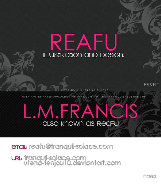
So I have this little dream, a dream about…well let’s say it has to do with anime and comic conventions. With that dream in mind, for the past year and a little bit I’ve been doing some research and secret cg artwork. What the artwork is for, will become clear in due time. For the curious, if you wish to see a few teaser photos of said artwork, I will direct you to my personal blog over at livejournal(be sure to respond to the introductory post and tell me a bit about yourself!). From my research I’ve learned the importance of putting one’s self out there and promoting themselves online. With that idea in mind, I’m going to try my hand at making…

BUSINESS CARDS!!!!

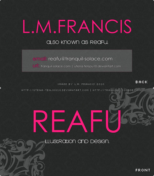
I rather like this second design. From what I’ve seen from other card designs by artists on deviantArt and elsewhere, they usually include their online alias SO I BETTER DO THE SAME NOW SHOULDN’T I?!?! Now it’s just a matter of getting these printed and choosing which one I like the most…Come on rounded corner card design!
Wow this is actually really similar to my old card design. I loooove the dark grey/black and hot pink color scheme! You picked out some really great patterns to use too, though I prefer the patterns on the top one more than the bottom one.
Suggestions!
1: Include maybe an example of your illustration? The card looks great design-wise but from looking at this, I wouldn’t remember a single thing about your illustrative capabilities.
2. Enlarge the text on the second design for your URL pleaaaaase. It’s so tiny I doubt it’ll be readable at any capacity when it’s printed. If you need to, just make the website into two lines like you did on the first design.
This is my most recent business card design:
http://blog.fourthewin.org/http://fourthewin.org/wordpress/wp-content/uploads/2010/05/businesscard-ftw_finniwip-tilt.jpg
Aaand my old one, which looks really similar to yours!
http://blog.fourthewin.org/http://fourthewin.org/wordpress/wp-content/uploads/2010/04/bzcard_2009.jpg
Oh snap you’re right! It totally wasn’t my intention swipe someone else’s design DX! I am so sorry ;___;! Always liked hot pink and that specific hotpink(with the hex code of #FF1D7D) I used to use a lot of gaia for Utena-themed RP’s. Figured it must have been good for something other than bright text! I like your current card design, it gives your site links and shows off your art, the older design is pretty too!
You;ve given me something to think about :D!