Variation of a familiar theme…
- April 29th, 2010
- Posted in internet
- Write comment
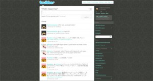
So I decided to change the look of my twitter page…
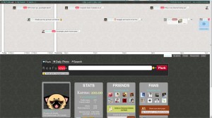
And then my plurk page…
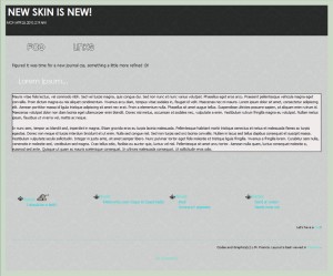
And finally my deviantArt journal CSS. Man…there’s something about those damask patterns that just give things a sort of “classy” and “mature” air to layout designs. I wonder how many other internet hangouts I will apply to damask patterns/textures to my layouts for. I think I may have created a monster, a damask monster!


No comments yet.